Stats and Charts
Stats and Charts Section
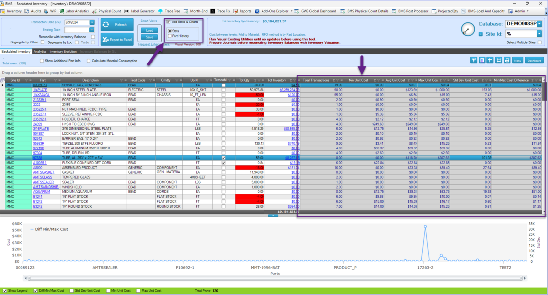
The "Stats and Charts" mechanism allows users to analyze variations in unit costs across all parts evaluated by the BMS-Inventory app. This feature can be particularly useful in identifying discrepancies within FIFO layers, large unit cost fluctuations, or other issues that may signal operational miscalculations.
If you are not interested in this type of analysis, you can uncheck the “Add Stats and Charts” box, which will shorten the calculation cycle of the tool.
The stats are displayed across six columns with a gray background. Each column has a filter in the header, allowing you to narrow down the selection of parts for more detailed study.

Column Descriptions:
1. Total Transactions – Displays the total number of transactions for a given part since the beginning of Visual, up until the cutoff date selected in the top-right corner of the window.
2. Min Unit Cost – The lowest unit cost recorded in any transaction for the part. A significant gap between the minimum and average unit cost may suggest inconsistencies in purchasing or other processes.
3. Avg Unit Cost – The average unit cost for the part, calculated across all transactions. This value helps identify typical costs and compare them with the current cost.
4. Max Unit Cost – The highest unit cost recorded for the part. Large variations between max and min unit costs could signal costing issues or problems with FIFO layers.
5. Std Dev Unit Cost – The standard deviation of the unit cost. This metric highlights variability in the transactional unit cost. Both the standard deviation and the min-max cost difference serve to indicate cost fluctuations. A high standard deviation or a large min-max cost difference may signal issues in costing consistency, potentially tied to irregular FIFO layers or market volatility.
6. Min/Max Cost Difference – This column shows the gap between the lowest and highest unit costs for a part. Like the standard deviation, it reflects how much the part’s cost fluctuates over time. A large value here may suggest unstable cost trends that warrant further investigation.
Chart Below the Data
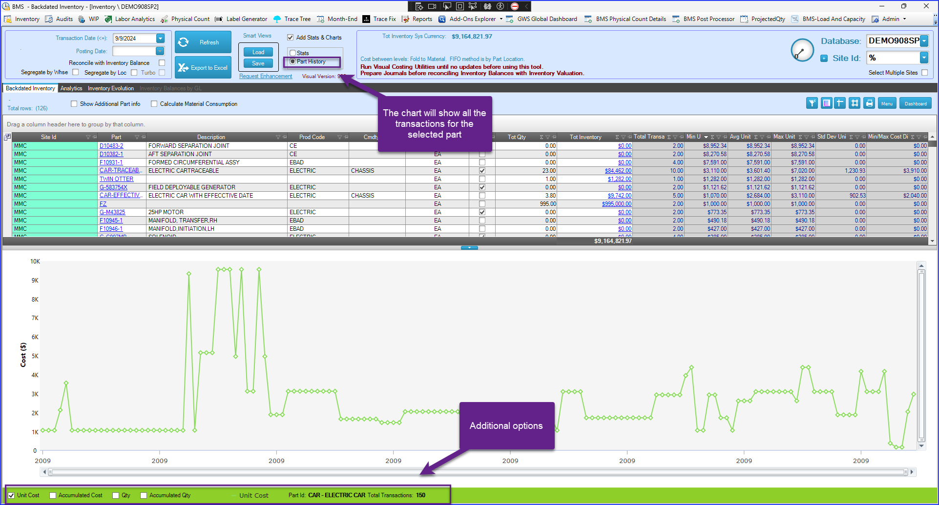
The chart displayed at the bottom of the screen provides a visual representation of the selected part's cost variations. This helps to quickly identify patterns or anomalies that may otherwise be difficult to spot in tabular data alone. For instance, if you sort the list of parts by "Min/Max Cost Difference," the parts with the biggest variations will be grouped together on one side of the chart. This clustering makes it easier to visually assess and focus on those parts experiencing the most significant cost fluctuations, which could signal operational or pricing issues that require further investigation.

